Kado
- Branding
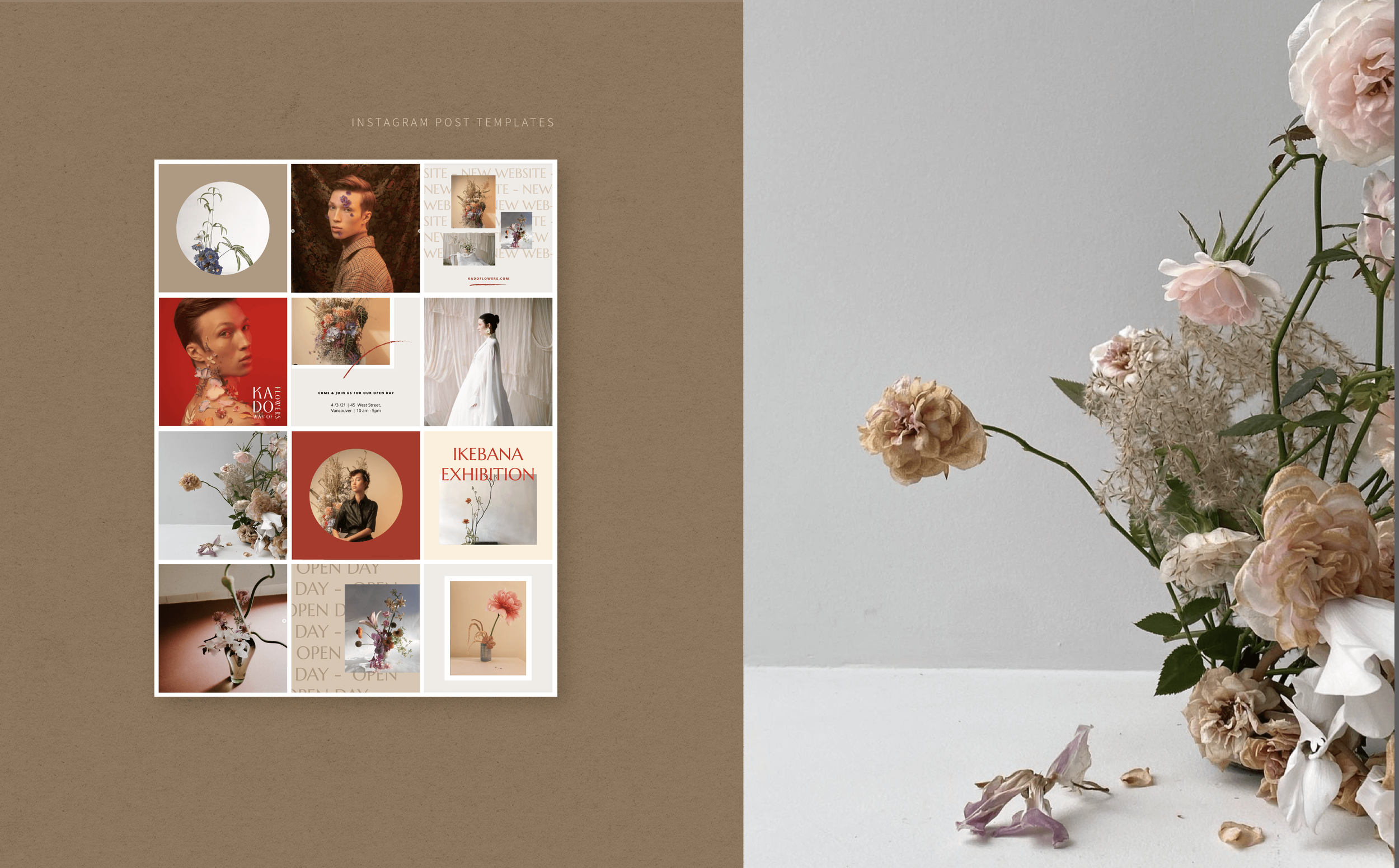
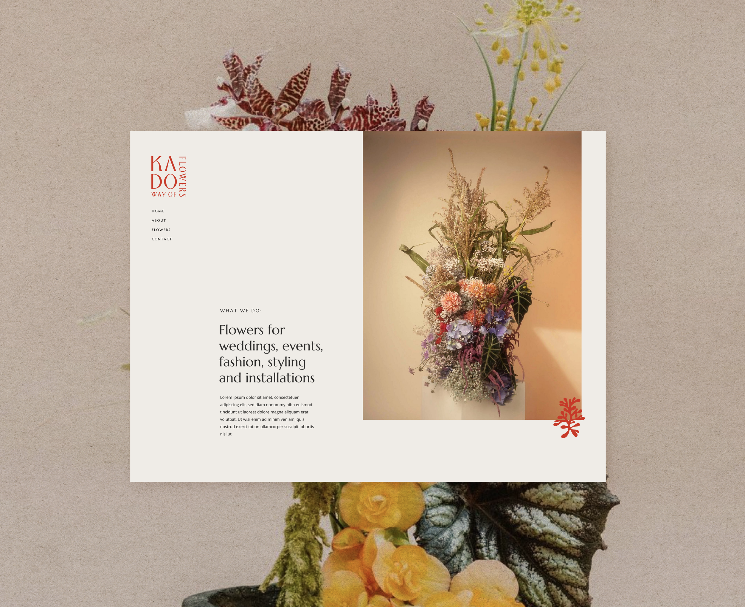
- Digital & Print Asset Design
About Kado:
Based in Vancouver BC, Kado Flowers, is a floral design service specializing in contemporary arrangements, styling, botanical set design, including floral sculpturing and installation. Kado focuses on the human experience within the connectivity of nature and its surroundings by integrating both eastern and western cultural viewpoints. Our studio strives to express the unfamiliar, yet draw the viewer into the feeling of nostalgia. Behind all of the creative designs is Kado Flower's founder and principal designer, Kyoko Higa. Kyoko finds inspiration in her Japanese roots and the wisdom of ikebana philosophy; central to which are the essences of harmony, minimalism, seasons, symbolism, and meaning.
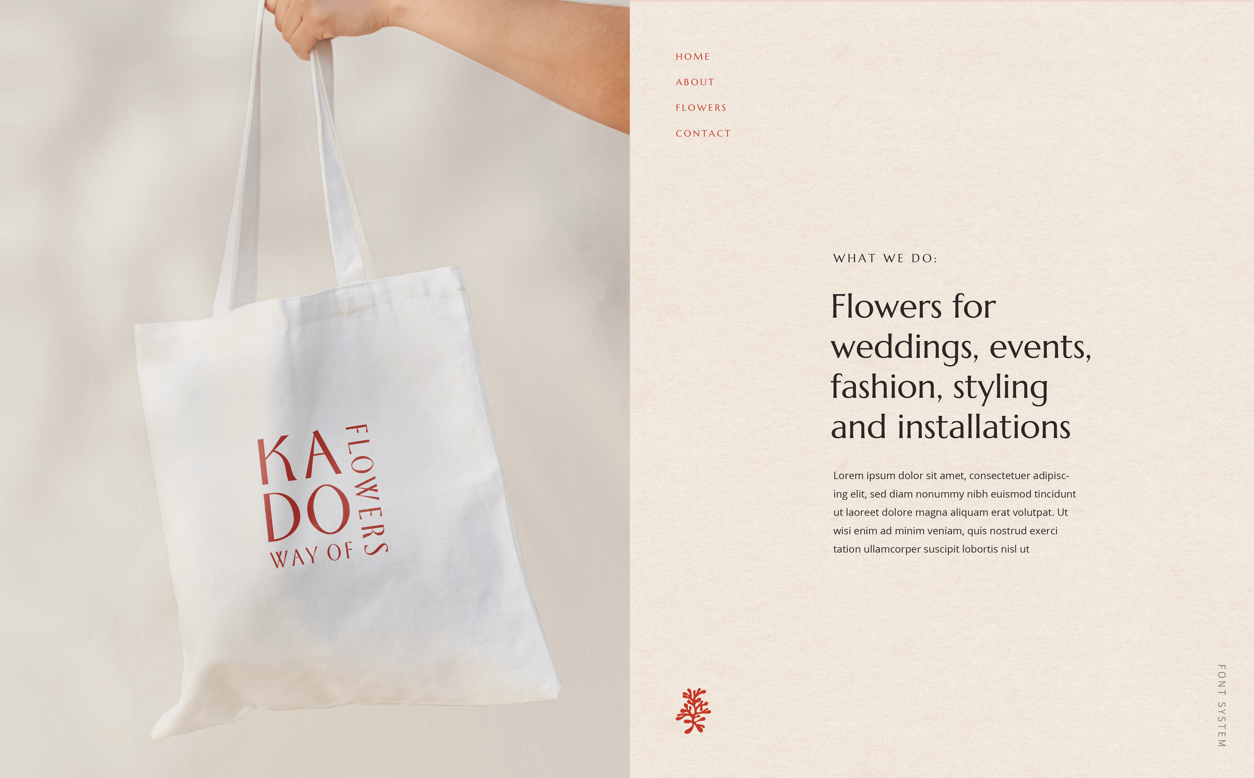
Design Concept:
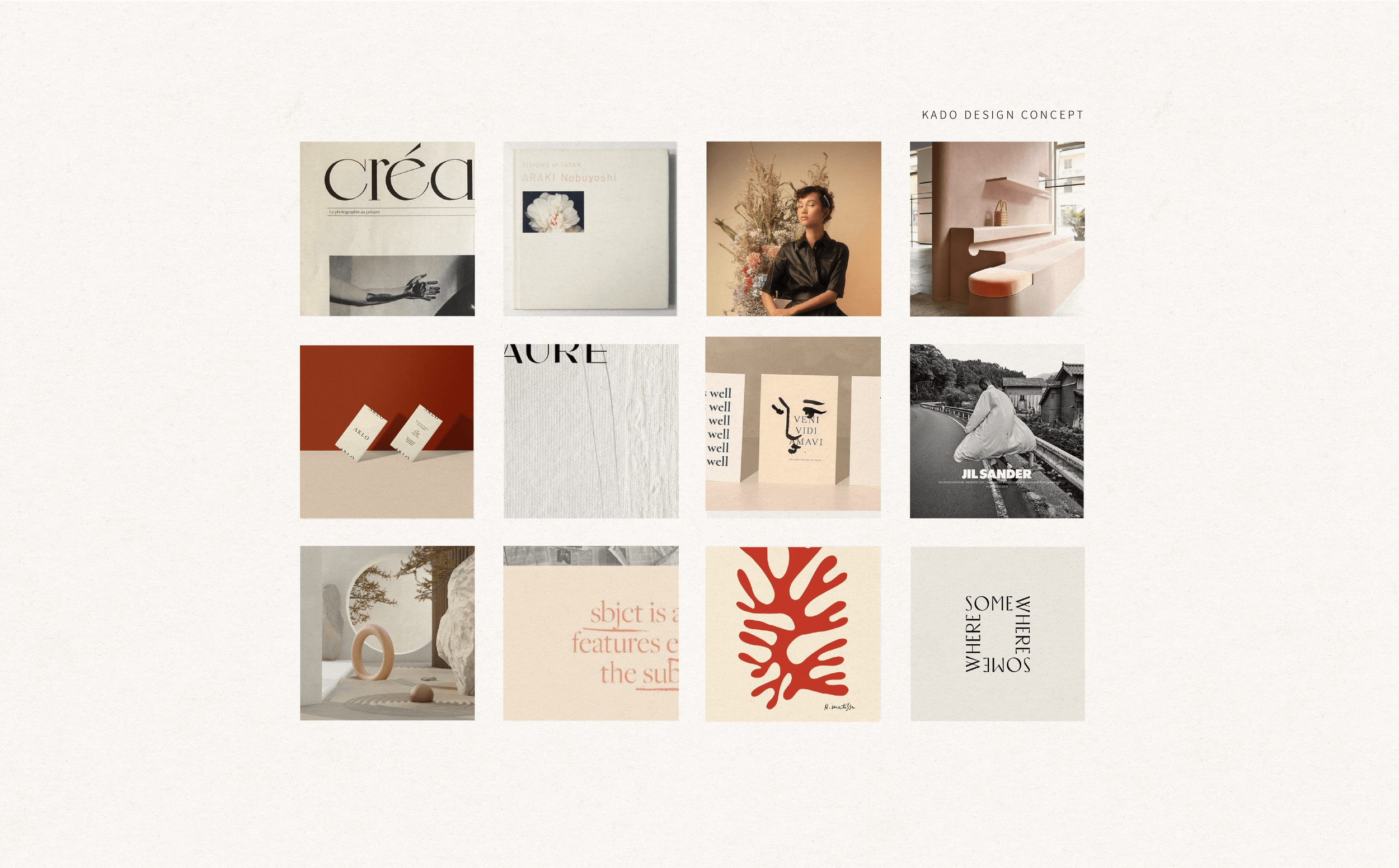
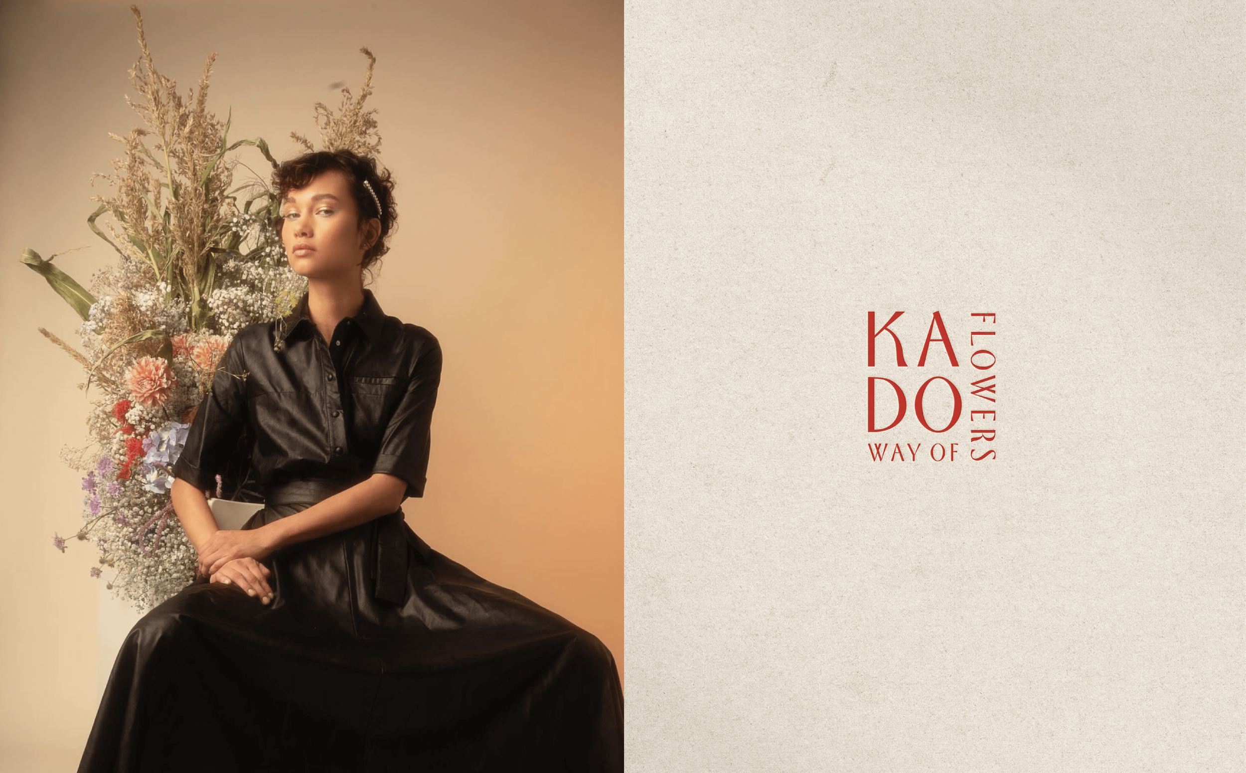
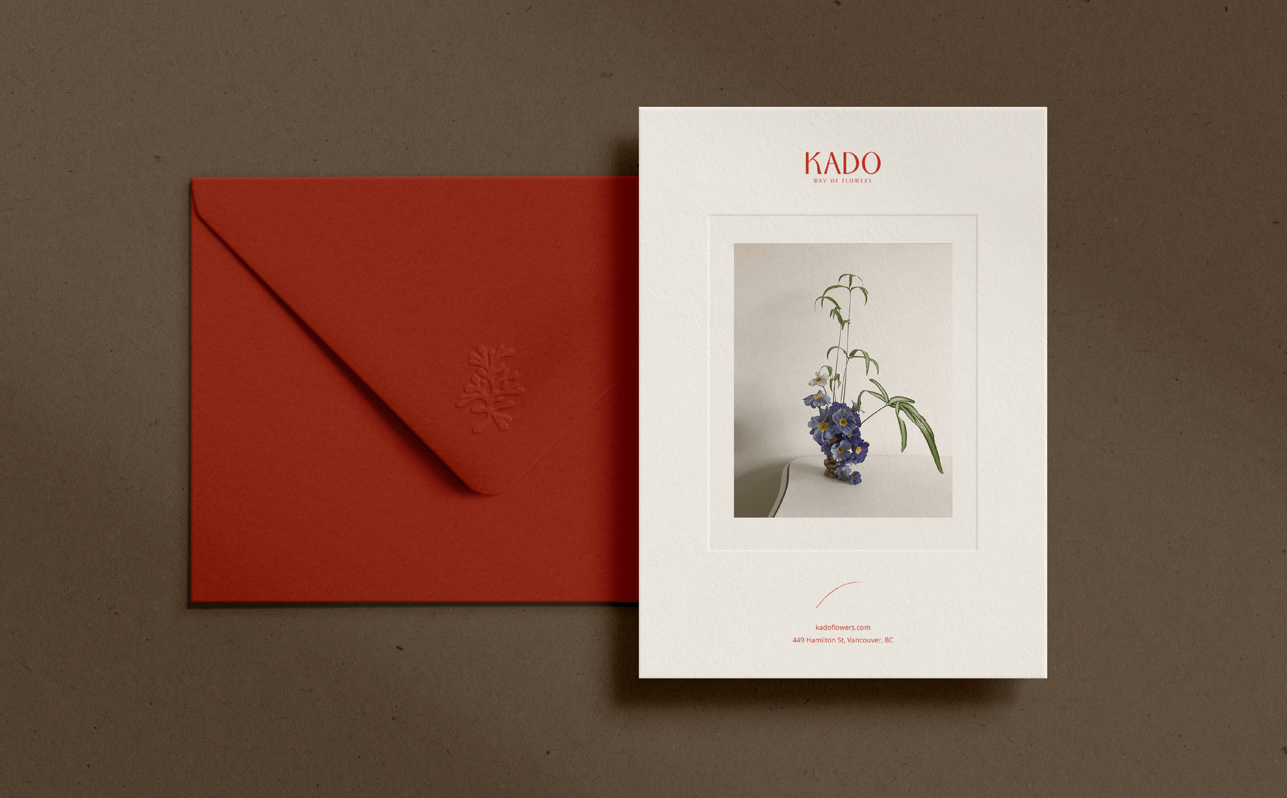
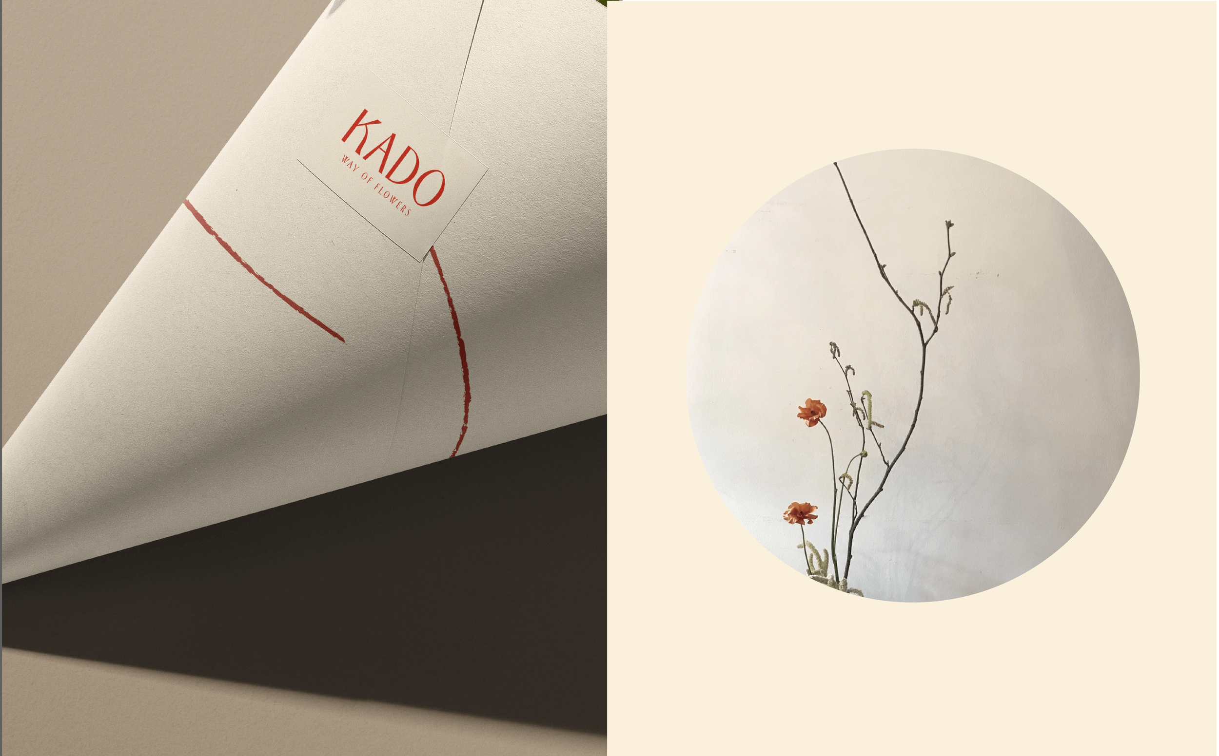
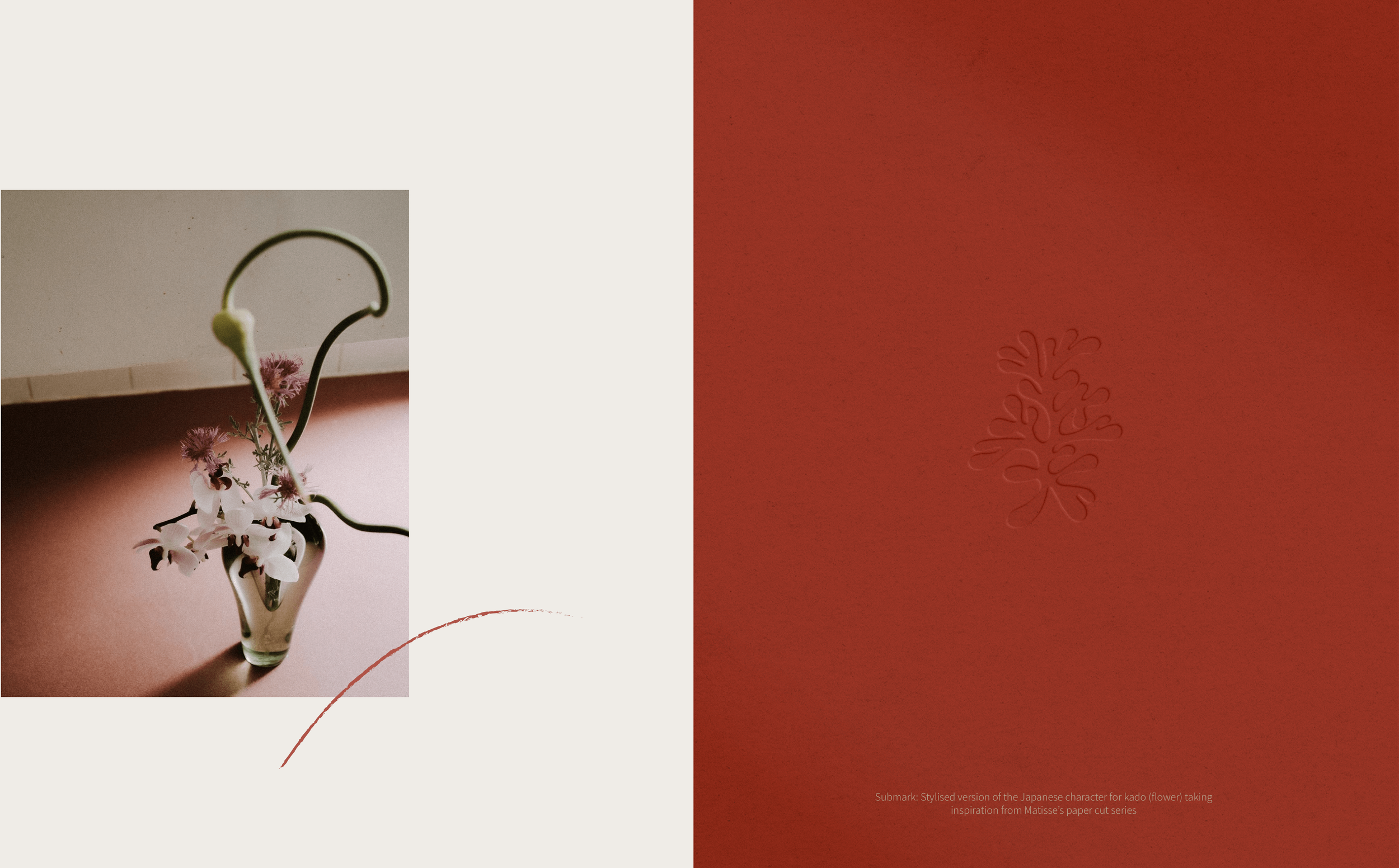
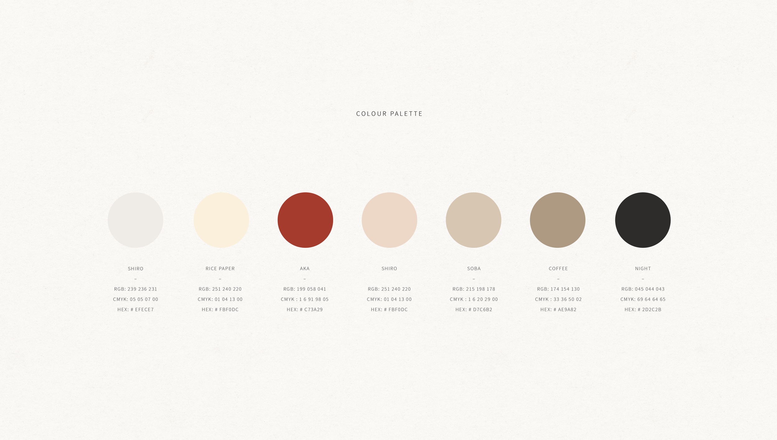
Taking inspiration from Kyoko’s Japanese roots mixed influences of western modern art, we created a distinctive and unexpected identity to match Kado’s floral designs. For the submark we were heavily inspired by Henri Matisse’s paper cut work (a favourite artist of Kyoko’s) and created a stylised version of the Japanese characted for kado (flower/way of flowers). We used red as the main brand colour supported by warm neautrals and took a wabi sabi approach to design layouts. Overall the brand is dynamic, tactile and personal aligned to the artist’s vision.